
Usability Heuristic analysis of Grab
AUTHOR
ALTHEA NGUYEN
PUBPLISHED
12TH JAN 2025
10 MIN READ
Introduction
This article focuses on analyzing 10 aspects of Grab’s usability in terms of screens or features, not merely analyzing good or bad UX.below.
What is Heuristics Evaluation?
It is a method to help identify and address usability issues in the user interface (UI) of digital products such as software, mobile apps, and the web.
Why do we need to evaluate Heuristics?
It is a method to help identify usability problems in the user interface. This method does not require user testing so it can save money and time.
Purpose of the article
Before considering whether UX and UI is good or not, we will look at whether a product is designed to be usable or not. This article only analyzes a few features, so I will not give a rating on the app.
After better understanding “What is Evaluation of Heuristics?” and “Why we need to evaluate Heuristics” then we will go to discuss the principle of Heuristics Usability
Visibility of System Status
The system needs to inform the user about what is going on in an appropriate way and at the right time.
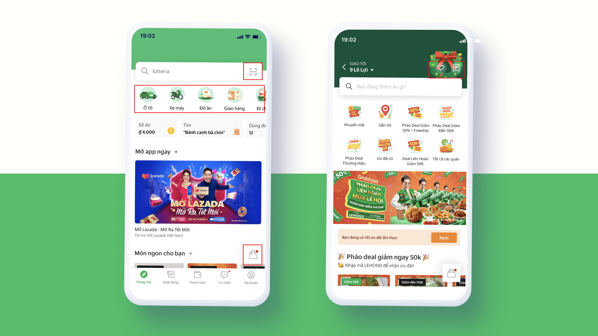
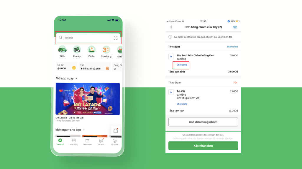
When users interact with any system, it is essential that the system provides immediate feedback. Many of us have had negative experiences that made us skeptical about how systems work. Simple visual cues, such as a change in button color, a loading indicator, or an icon, can help users understand what is happening and reduce the likelihood of unnecessary actions. For example, in the Grab app, a red dot serves as a feedback message to indicate that there is an item in the cart ready for payment. Additionally, rather than leaving the wish list blank when there are no items, the app displays an illustrative image to inform users.
For example, on Grab screens, there will be a feedback message such as a red dot informing that the cart has an item to pay for, or in the wish list instead of leaving it blank because there is no item, there will be an image which illustrate to the use

On other screens such as the food ordering screen, there will be a line of text notifying the closing time so that users can estimate the time, limiting the case of choosing a dish but not being able to order food because the restaurant has closed.
In each process of booking a car or ordering food, there is also a progress bar,

Match between system & the real world
The system should display the user’s language (phrases, concepts familiar to the user) to communicate with them rather than using system-specific terminology.
People approach every new system with a mental model in mind. In other words, they infer how the system might work based on their experience with other similar systems. By using language they are familiar with, you can help users overcome their initial confusion.
Even in today’s minimalist world, dozens of designs still exist from that era: apps like compasses or calculators, or design elements like folders, toggles, or lock icons. Additionally, language and concepts from the real world help users easily understand the system. That’s why the card storage app is called “Wallet,” “Bookmarks” are used to save your favorite websites, “Trash” is used to delete old files, or “Cart” is used when shopping online.
Take Grab screens, for example, where icons are designed based on shapes and familiarity from the real world
User control and freedom
Users will occasionally select the wrong function and will need an obvious “emergency exit” to leave the unwanted state without receiving another extended message.
A suitable emergency exit could be something as simple as a back arrow (e.g. in a browser), a trash can, which protects us from accidental deletions, or an “undo” button, which allows the user to undo the last action. All of these examples demonstrate systems that do not frustrate users when they make mistakes, and instead allow users to correct their mistakes.
User freedom can also be seen in Skip buttons, where users do not need to see instructions on how to use a feature, they have the flexibility to take control using Skip buttons.

Consistency and standards
An effective interface design should not leave users wondering whether different words, contexts, or actions mean the same thing.
Have you ever noticed that the copy-paste function works exactly the same, no matter what app you’re using?
An understandable system should never confuse users by using different words, images, or actions for the same concepts.
“Don’t forget that people spend 90% of their time interacting with other apps.” ( Jacob’s Law)
Error Prevention
The system needs to eliminate errors that are likely to occur for the user, or check and notify them before they confirm the next action.
Based on Don Norman’s book Designing Everyday Things, there are two types of errors that occur when interacting with a user interface: unintentional errors and errors due to mistakes.
Inadvertent errors occur when a user tends to perform one action, but due to lack of attention, performs another action (e.g. when performing a known task). A strategy to prevent users from making wrong choices is to minimize the possibility of them making wrong choices by only guiding them through safe areas. Use constraints that do not allow users to enter incorrect values (e.g. when you expect a number, do not allow letters), suggest the most common options to help users easily choose (e.g. while searching), or use a confirmation dialog before taking action.
For example, the screen below in the search bar will have a placeholder suggesting services to search, helping to navigate users to choose more correctly so that no results are found.
Flexibility and efficiency of use
Accelerators – Invisible to new users – can speed up interactions for long-time users so the system can serve both audiences.
Every user is unique; each has different needs and skills. Likewise, each task is unique and requires different controls.
Make the screen cleaner and navigate the application easier. The application will always display only relevant UI elements and commands.
A new user who is learning will always have different needs than a professional who uses it for hours every day. A power user may appreciate advanced options, keyboard shortcuts, or even the ability to extend and customize the look and feel of the application. Power users need to save time and perform tasks quickly, but also accurately and reliably. A good user interface should provide appropriate functionality for both inexperienced and experienced users.


Help users recognize, diagnose and recover from error
Error messages should be presented in simple, easy-to-understand language (system jargon should not be used to inform users), accurately describe the error the user encountered, and provide step-by-step suggestions for how the user can resolve the problem.
Errors and crashes of any kind can be frustrating for users. Especially when they are poorly designed and communicated. Whether we like it or not, users tend to get themselves into situations that they need to figure out how to get out of. To minimize frustration, we should put as much effort into designing the error experience as we do into the rest of the system. Any error message should be as clear and concise as possible. No one wants to read vague messages like “something went wrong.”
Give users some constructive advice on what to do next. Suggest a solution or direct them to a customer support representative who can handle the situation. And remember to use polite error messages, never blame the user or imply that they are stupid.
