Nowadays, the hospital system in Vietnam is managing vaccination records in the form of paper injection books, each individual will keep his or her own vaccination book.
With a paper vaccination book, injectors often face difficulties in managing the book such as losing the book, having to keep many vaccination books for many different vaccination centers, difficulty in keeping track of vaccination history. Some vaccination centers, do not save the vaccination history of the injector into the system, leading to a difficult situation is looking up the patient’s vaccination record. below.
Goal
Our main goal is to build an application to book online vaccination schedules and manage vaccination records, which will cover up the real problems, user expectations, and other essential insights.
Design process
I used double diamind framework to understand more about the product faster and agile methodology to meet tough timelines by the adaptive planning.
Research method
To hone in on the exact problem faced by locals in Vietnam, competitive analysis, desk research and user interviews were carried out.
Competitive audit
I started this project with Competitive Analysis to have an overview picture of product in the market and what features they offered.
User reviews
To understand better the weak points of the other Vaccine booking app and improve for my vaccine booking app, I started researching app reviews on the app stores. This allowed me to get a deeper understanding of user impressions and generally how users felt about the app overall. Some users definitely raised some good points, for example:
Annoying ads
Login option missing
Reminder issues
Usability issues
User interview
Based on a sample group of 10 users, I tried getting feedback to complete the analysis and to highlight the users’ particular interests and needs. the goal of research is to answer questions:
👉 How are user currently looking up for vaccine and booking vaccine appointment?
👉 What are the challenges that users face in looking up and booking? Why?
👉 How do users manage vaccination information? How do users remember the next vaccination date?
Define
Persona
Going further through the research, I identified 2 different personas which have a different context but similar aspirations:
User Journey Map
In a product in general or a product group of the same company in particular, it is necessary to ensure the consistency of color, font style and icon throughout the use process. Not only that, all images used in a website or app should be treated the same.
We should also avoid using different design styles for elements on different pages like the Game below. The OK button has a different design on each screen. A designer should not leave his users wondering if the difference in the change between these two buttons has any deeper meaning.
Problem Statement
After going through all the research, I started to form the problem statement for the project:
Develop
Story board
I created a storyboard describing my user’s experience with the app. This is a great tool to explore how the product will be used in a larger context, as if it was a part of a bigger narrative. It’s an effective and inexpensive way to capture, relate, and explore the app in a real world setting.
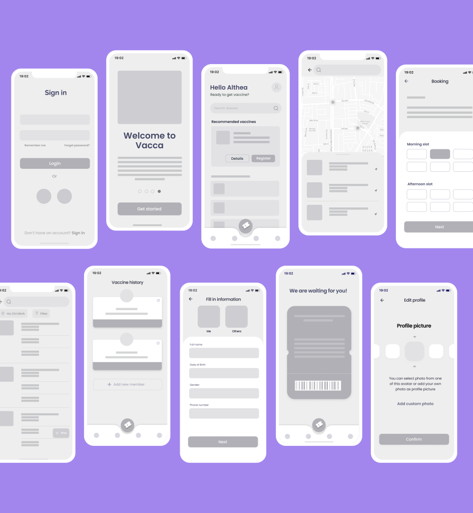
Wireframe
This visual guide represents the skeletal framework of the app. It helped me arrange the interface elements while I focused on the functionality rather than what it looks like. Moreover, the simplicity of wireframes allows me to quickly test ideas without diving into the details.
Visual
Onboarding
The goal of onboarding is to introduce the service and its benefits. The screens are designed eye-catching and integrated with functions to minimize user’s skipping screens
Sign up/Log in
The goal of the onboarding flow in Vacca is to collect information about the users to truly make it tailored to their needs. The critical part was to have the user answer personal questions without getting discouraged and turn off the app. It required a simple and quick process.
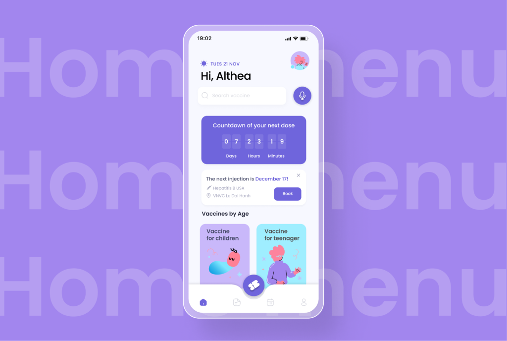
Home menu
The homepage screen is the first screen when users enter the app, so it is advisable to shorten the information, leaving only some important information, especially for users using the app for the first time. Because having too much information will confuse users and make it difficult to make decisions. The search function allows searching by voice because there will be cases where users can’t remember the spelling of the vaccine but only remember how to read it.
In the middle of the screen, there will be a floating button displaying a ticket that includes the patient’s information as well as the vaccine type and appointment date and time and user’s code. The information on the main screen will also be different for users who have used the app and users who have never used it.
For example, the case of new users for the first time will have information about recently popular types of information or vaccines by ages. In case users have used the app, there will be reminders to schedule the next injection appointment.
Booking vaccine
Conclusion
What did I learn?
All in all, there were definitely difficulties encountered along the way but I really enjoyed tackling this problem. I felt I made effective use of my ability to manipulate the form to create a solution that addresses the central design problem of users.
I understood the needs of the users through the survey and conversations. Finally, I faced the challenge of creating an engaging app both from the user experience perspective and the visual perspective.
What are the next steps?
Deep research about specific features
Usability test of the prototype with users
Improve user flow
A comprehensive business model
Continue to build more future features
Thanks for reading thus far! Do get in touch with me on LinkedIn for any kind of feedback, suggestions or collaborations!